Power BI Design System
Accessible defaults, not another style guide
- Role
- UX/UI Designer — led the audit, system foundations, Power BI components, templates, documentation, and rollout
- Status
- Government of Ontario · Shipped internally
- Timeline
- 2025–present
- Methods
- Workflow observation · audit of 20+ reports · accessibility review · component inventory · design-system benchmarking
- What changed
- 15 reusable chart patterns, page templates, plain-language guidance, and a report QA checkpoint
The project began with a recurring workflow problem: analysts were solving the same visual and accessibility decisions in every report. The system encoded those decisions once, then placed them inside a workflow people already follow.
20+ existing reports
60% of checked charts failed contrast
15 reusable chart patterns
Foundations · components · templates · governance
Template anatomy: page, hierarchy, metadata, and controls
One working report structure combines the foundations and components documented in the system.
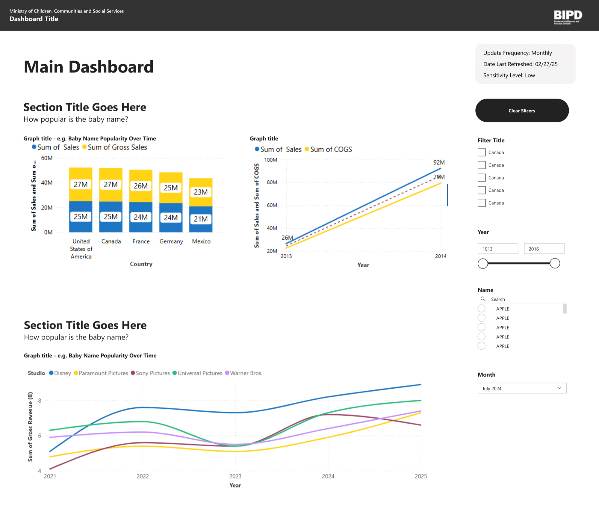
01 · Page anatomy
A fixed header, content column, and filter rail create a predictable reading order.
02 · Information hierarchy
Dashboard, section, chart, and axis titles use defined roles rather than local formatting.
03 · Operational context
Refresh date, frequency, and sensitivity stay visible instead of being buried in notes.
04 · Reusable controls
Slicers and reset actions follow the same placement and treatment across reports.
Workflow pain — routine dashboard work kept reopening the same decisions
I found the problem while building and reviewing Power BI dashboards as part of my regular work. Each report reopened decisions about typography, chart colours, spacing, filter placement, and page structure. Analysts could produce a working dashboard, but they had no shared answer for what a release-ready dashboard should look like or how it should meet accessibility expectations.
The same feedback resurfaced during reviews: adjust the hierarchy, restyle a slicer, choose a more accessible palette, or explain why one dashboard behaved differently from another. What initially looked like individual formatting work was a system gap. The organization was asking each analyst to rediscover decisions that could be designed once and reused.
Rebuilt headings, charts, filters, and spacing from a blank canvas.
Repeated the same visual and accessibility feedback across reports.
Had to relearn hierarchy and interaction patterns from one dashboard to the next.
Audit — the same friction appeared across more than twenty reports
I documented chart types, page structures, colour use, interaction patterns, and accessibility failures across more than twenty existing reports. The audited set contained eight different palettes; sixty percent of the charts checked did not meet the contrast threshold used in the review.
I also inventoried what analysts repeatedly rebuilt—common charts, slicers, tables, status treatments, headers, and page layouts—then benchmarked the Ontario Design System, WCAG 2.1, IBM Carbon, Google Material, and the UK Government Design System. The comparison separated government brand foundations, accessibility requirements, and data-visualization patterns that Power BI could realistically support.
- Observed
- What I repeatedly built, changed, and reviewed in the working process
- Checked
- Contrast, hierarchy, labelling, and consistency across the audited set
- Inventoried
- Recurring charts, controls, tables, and page structures worth turning into components
Principles — define what the system must do before styling components
Four requirements followed from the audit: work inside Power BI, remain understandable to non-designers, make accessibility visible in the default, and produce a recognizable hierarchy regardless of author.
Consistent reading
The same type of information appeared with different visual treatments.
Define repeatable patterns for charts, KPIs, filters, tables, and page structure.
Accessible differentiation
Colours that worked for interface controls were not always distinct as adjacent chart marks.
Test data palettes as combinations and require labels or other non-colour cues.
Protected semantics
Red, amber, and green could be used as ordinary series colours, weakening their status meaning.
Separate semantic colours from categorical data colours and document when each may appear.
Low-friction adoption
A standards document alone would add another task to an analyst's workflow.
Package guidance into templates, examples, and an existing quality checkpoint.
Build — connect foundations, components, templates, and guidance
Colour roles before colour values
Interface palettes are often checked as text or controls against a background. Data visualization adds a different question: can a reader distinguish neighbouring series? I explored palettes with variation in both hue and luminance, then separated categorical data colours from alert, warning, and success colours. The guidance also required direct labels or other cues so colour never carried meaning alone.
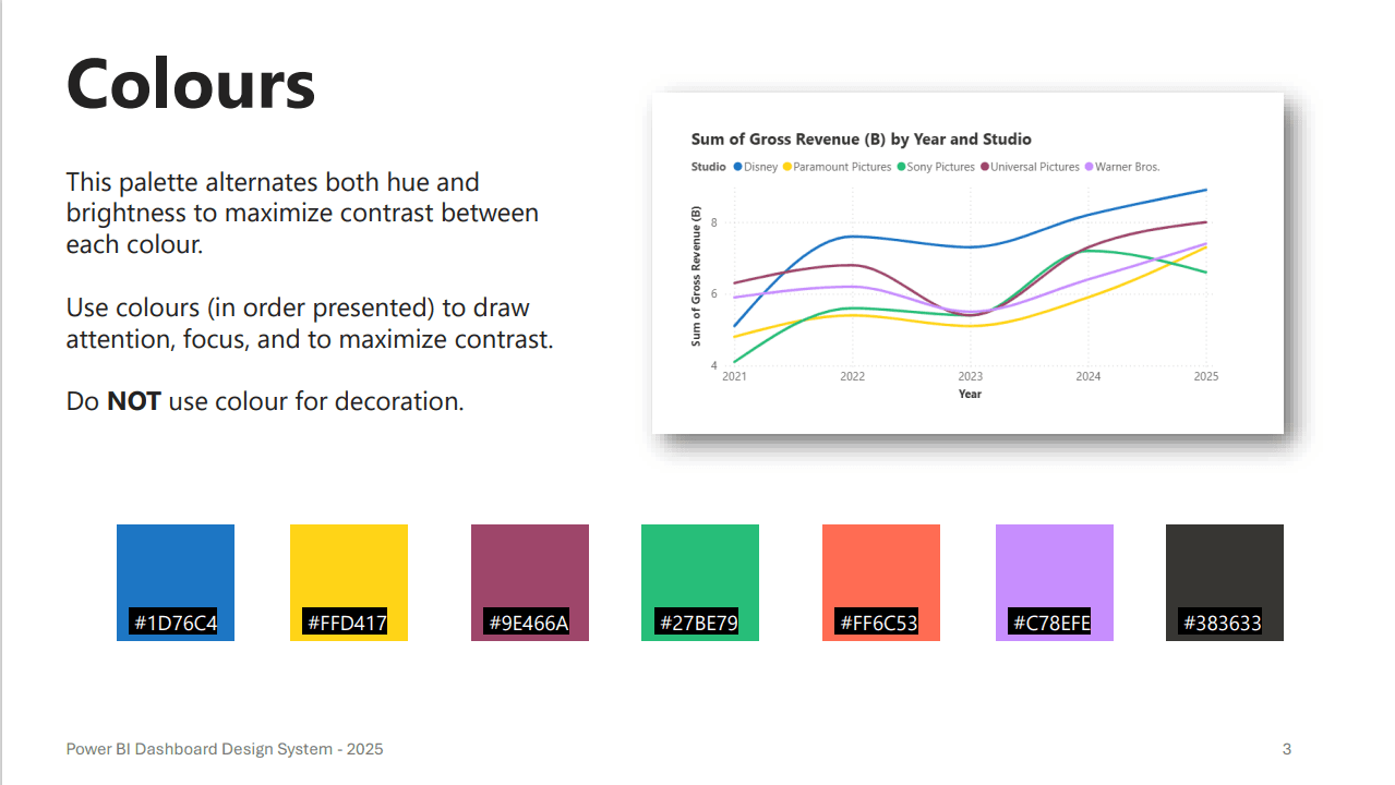
Differentiate data, not decorate the page
The sequence alternates hue and luminance so adjacent series remain distinguishable. Guidance defines an order of use and prohibits decorative colour.
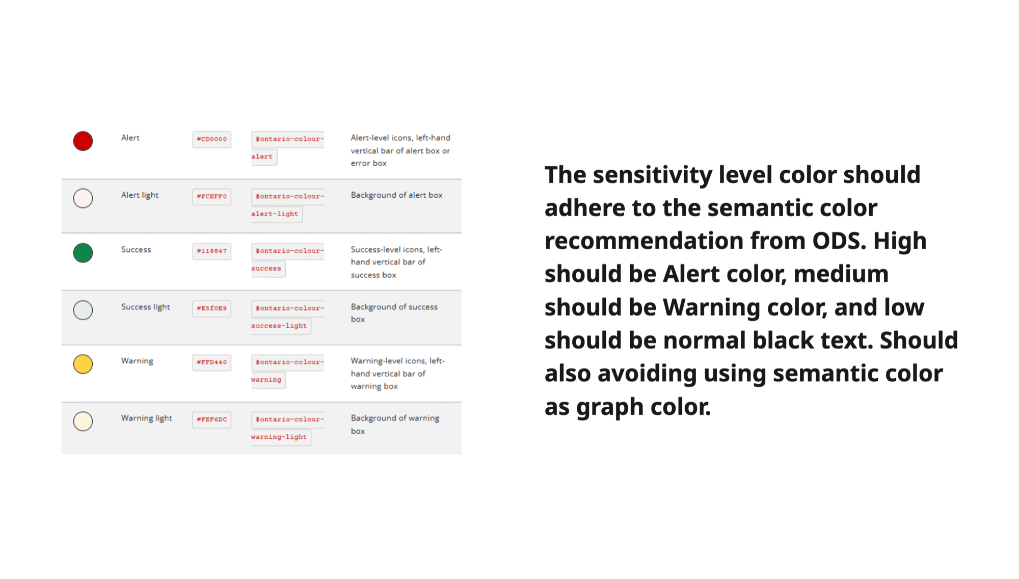
Protect the meaning of status colours
Alert, warning, and success colours are reserved for status. The rules prevent red, amber, and green from becoming ordinary chart decoration.
Typography and spacing as reusable foundations
Named text roles cover dashboard titles, section headings, chart labels, filters, legends, and axes. A small spacing scale specifies the distance between sections, visualizations, margins, and filters.
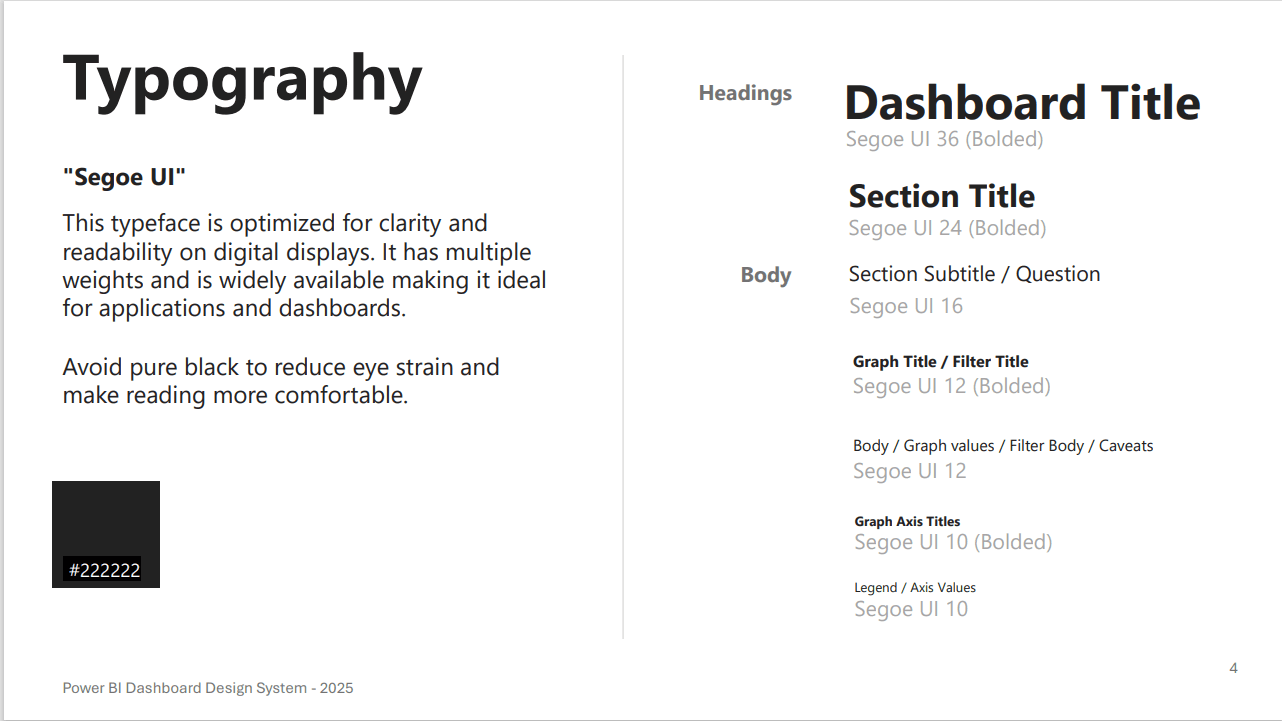
Named styles map dashboard, section, chart, filter, and axis text to a consistent hierarchy.
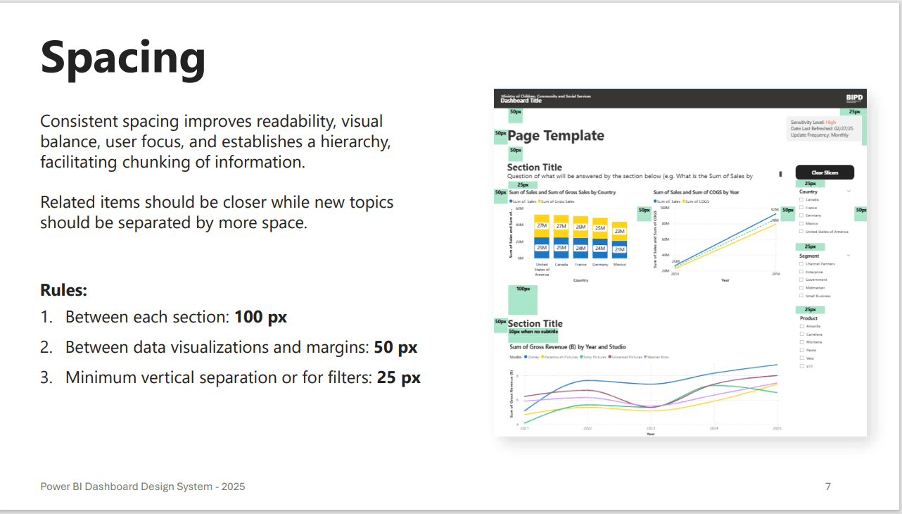
A small spacing scale groups related content and separates sections without relying on visual guesswork.
Components that package the full decision
I built the fifteen most common chart and report patterns as reusable Power BI starting points, including bars, lines, KPI cards, tables, filters, and status treatments. Each component bundled typography, spacing, labels, and colour behavior. The analyst's task changed from assembling a visual style to selecting the correct pattern and replacing the dummy data.
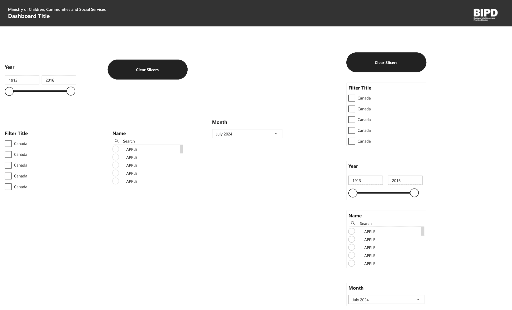
Reusable slicers, search patterns, date ranges, dropdowns, and reset actions standardize common interactions.
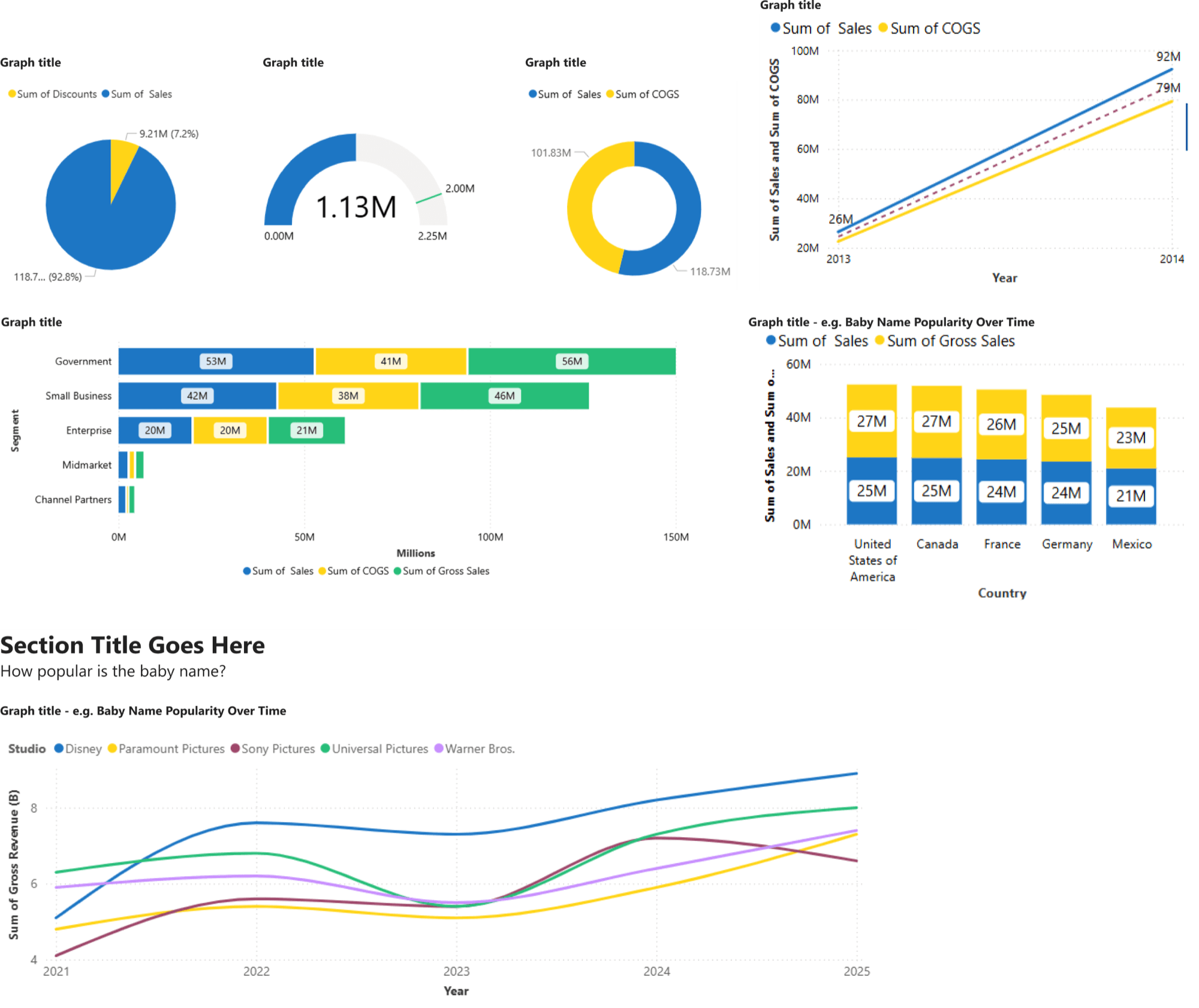
Chart examples bundle palette order, legends, labels, axes, and data density into repeatable starting points.
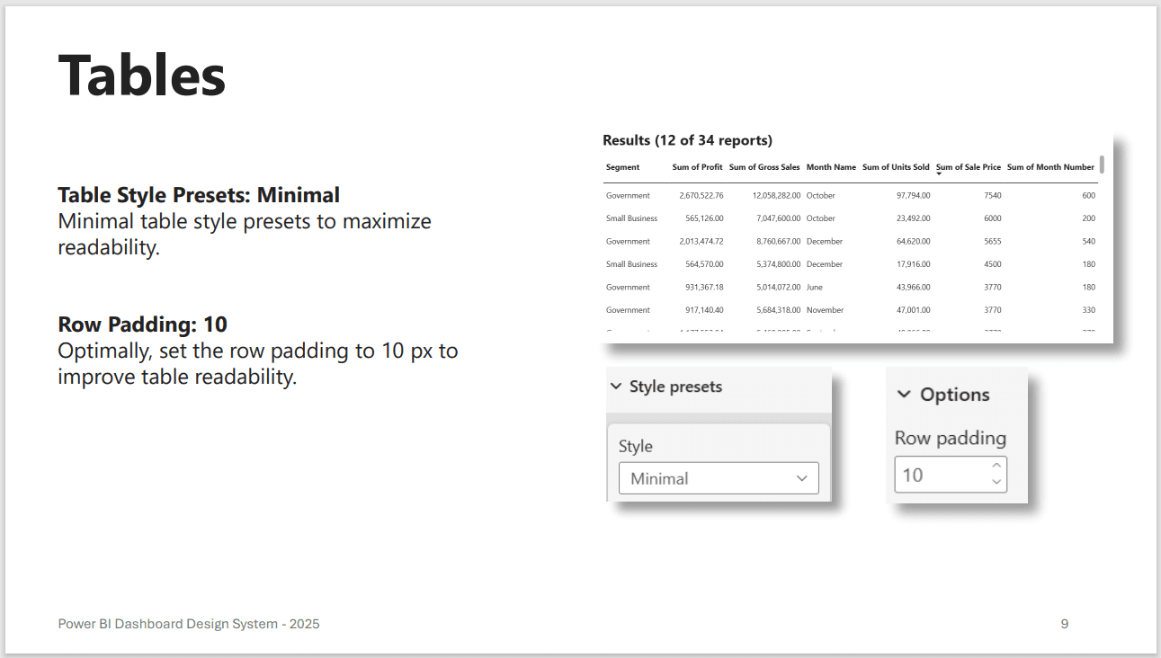
Table guidance specifies minimal styling and row padding so dense results remain readable.
Templates connect the pieces into a working report
Components alone could still produce an inconsistent page. I assembled them into templates with standardized headers, metadata, content areas, filter placement, and spacing. The accompanying documentation explained why each rule existed and showed how it appeared in a completed dashboard, rather than asking analysts to translate standards language on their own.
Adoption — design the path from resource to routine
A component library does not change behaviour by existing. I created a quick-start guide organized around choosing colours, arranging filters, and setting up a page, then introduced it at a division meeting.
The durable change came when leadership integrated the standards into the report pre-assessment workflow. Reports were checked against the system before release. That shifted it from an optional resource to a shared definition of readiness.
- 01
Notice
Capture repeated authoring and review friction in daily work.
- 02
Audit
Check whether the same problems recur across the report portfolio.
- 03
Systemize
Encode foundations, components, templates, and guidance.
- 04
Sustain
Check reports against the standards before release.
Impact — shared defaults became organizational infrastructure
The system rolled out across a division and partner network of more than 200 staff and was integrated into the official quality-assurance process. Team feedback identified the resource as useful, and analysts reported that previously time-heavy choices—especially colour selection—became easier. New reports could begin from the same visual and accessibility baseline instead of reconstructing it.
200+ staff and partner users
Report pre-assessment checkpoint
Reusable defaults replaced repeated styling decisions
The case does not publish internal reports or underlying government data. All dashboard visuals on this page are sanitized recreations with dummy values.
Learn — a design system includes the workflow around its components
The most important design decision was not a palette or component. It was locating the system inside a workflow people already had to follow. Templates reduced effort; the pre-assessment checkpoint made consistent use sustainable.
The audit measured a sample of existing reports, not every report in the division, and the project did not establish a controlled before-and-after measure of authoring time. A stronger next evaluation would track time to create common pages, the number and type of accessibility defects found at QA, and whether readers interpret the same chart consistently across reports.
A reusable component solves one report. A shared default, documented rationale, and release checkpoint make the solution durable across a reporting practice.