First-Time Banking Study
Where first-time visitors lose confidence
- Role
- UX Researcher & Designer — five-person academic team; no client relationship
- Status
- Independent evaluative study
- Timeline
- 2025
- Methods
- Moderated scenario-based evaluation (N=6) · think-aloud · SUS · product reaction form
- What changed
- Task-level design requirements and concept directions; concepts not implemented
Task completion was not enough: the study paired step-level behavior with think-aloud evidence to show where people finished a task but still lacked confidence in the decision.
N=6 first-time visitors
72.1 SUS score
66.7% mortgage success
6 of 6 missed the key result
Make the decision visible before asking people to act
These concepts translate the study into testable hypotheses. They were not commissioned by BMO and are not presented as shipped work.
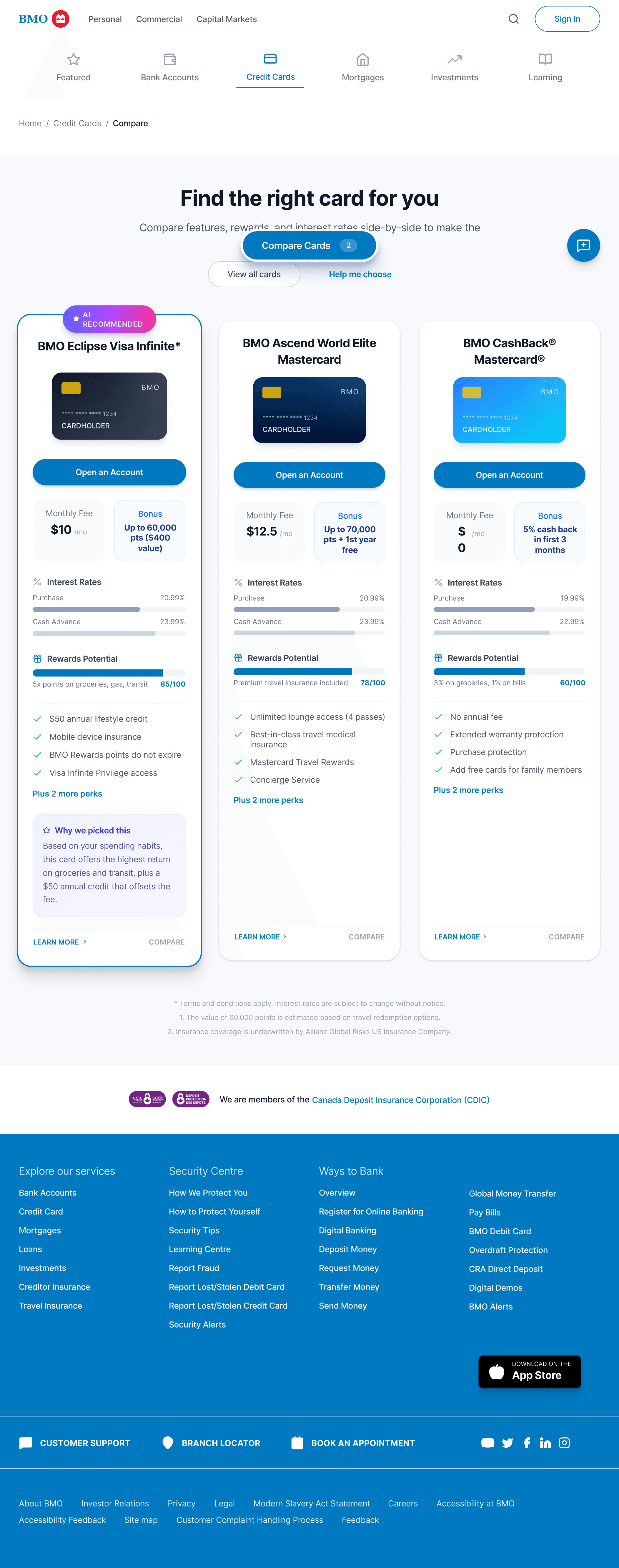
01 · Product comparison
Moves differentiators and the reason for a recommendation into the decision surface.
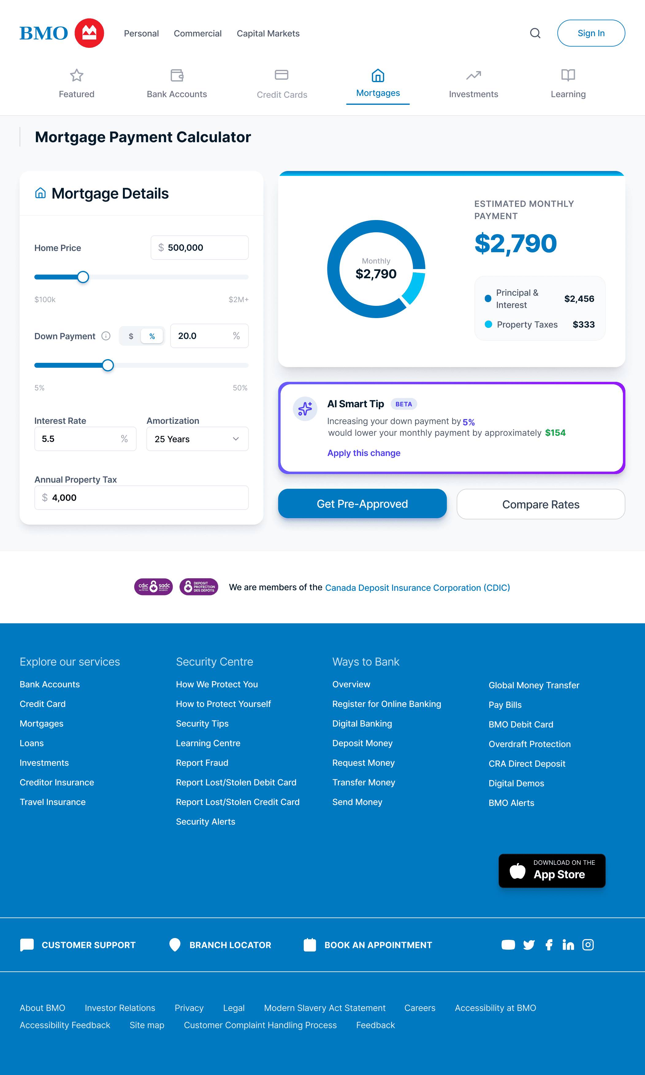
02 · Mortgage calculator
Keeps the monthly payment visible while inputs change and connects the result to a next step.
Problem — professional did not always feel understandable
A bank's public website asks people to compare products before they have learned its vocabulary. For a first-time visitor, choosing an account or estimating a mortgage is not a routine navigation task: the interface shapes whether the decision feels safe enough to continue.
This independent academic study evaluated BMO's public personal-banking website. It did not involve BMO as a client. Participants generally described the site as trustworthy and professional, yet the task evidence showed a different layer of the experience: people could reach pages and still remain unsure which option, tool, or result mattered.
Where does the public site make a first-time visitor remember, interpret, or guess more than the financial decision requires?
Method — test complete decisions, not isolated screens
The detailed evaluation round included six participants aged 18–34. None used BMO as their primary bank; they brought expectations formed by TD, RBC, or CIBC. Each moderated session used think-aloud across three scenario-based tasks: compare chequing accounts and find opening requirements, choose a no-fee cashback card, and calculate a monthly mortgage payment before locating pre-approval information.
Scenario tasks fit the question because the friction often appeared between pages. A page-level heuristic review could identify inconsistent labels, but only an end-to-end attempt showed whether a participant chose the wrong calculator, missed a result, or abandoned a comparison feature.
- Behaviour
- Task success, step errors, path taken, and observed hesitation
- Interpretation
- Think-aloud comments and a semi-structured debrief
- Benchmark
- System Usability Scale after the session
- Perception
- Product reaction words to separate visual trust from task clarity
The method separated what people did, how usable it felt, and how the experience was described

Behaviour in context
Moderation and observation captured hesitation, wrong turns, and workarounds that a post-task score could not explain.
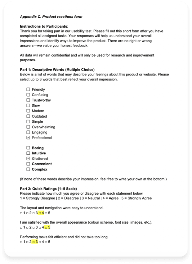
Trust and friction can coexist
One completed form selected both “Professional” and “Cluttered,” a useful reminder that visual credibility does not guarantee decision clarity.
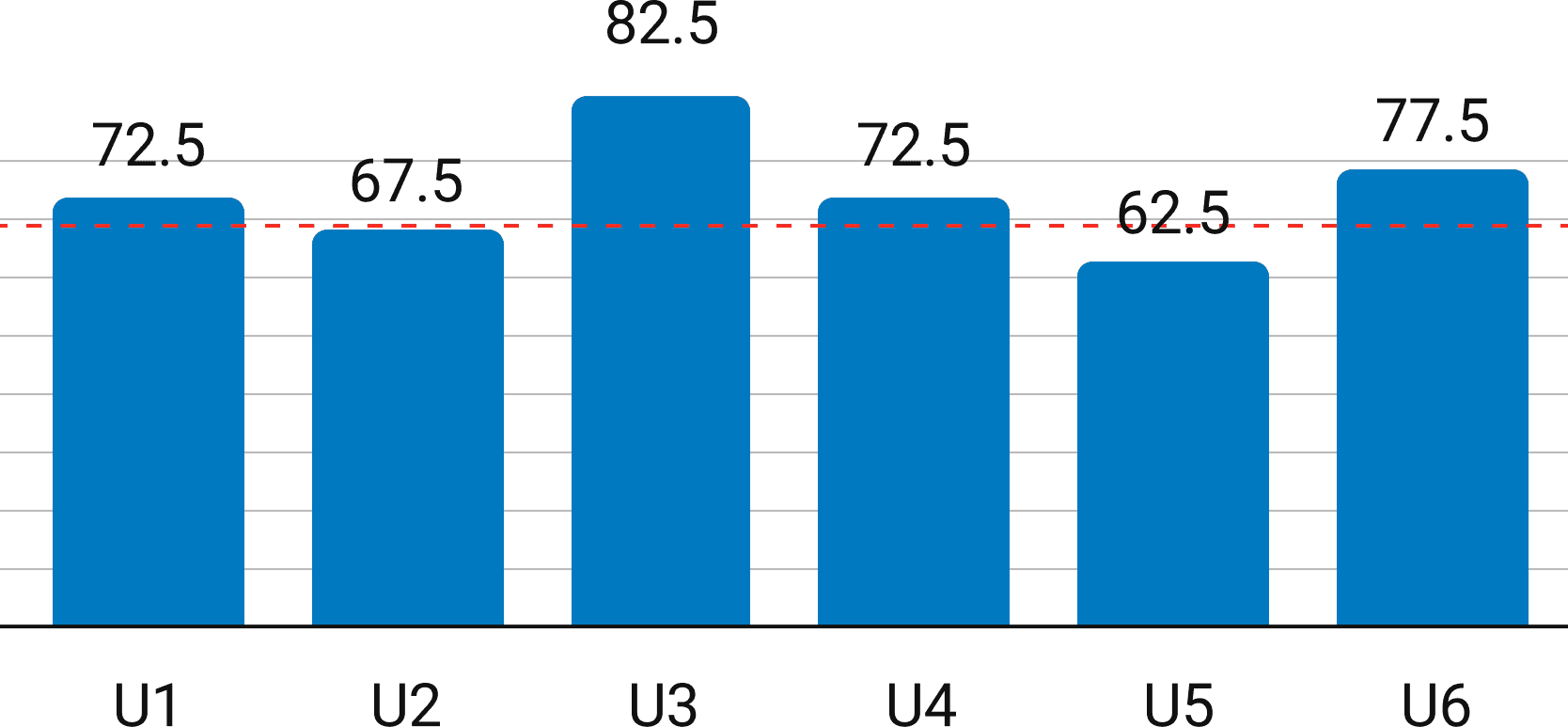
An average can hide the spread
The 72.1 mean sat above the conventional 68 benchmark, while individual scores ranged from 62.5 to 82.5.
This was a five-person university team. We rotated moderator, observer, and note-taking roles across sessions and synthesized the shared evidence. I also translated the findings into interface concepts; those concepts are hypotheses, not evidence of an implemented outcome.
Evidence — trace each finding back to a task step
We marked every success criterion by participant and recorded the observed problem beside it. This kept memorable quotes from outweighing behavior. A finding became important when the same issue appeared across participants or across more than one product journey.
Chequing accounts
5 / 6
4 bypassed comparison; 3 could not find opening requirements.
Credit cards
5 / 6
Only 2 used the comparison tool; the others scanned cards manually.
Mortgage calculator
4 / 6
2 chose the correct tool directly; all 6 missed the monthly-payment result.
| Success criterion | P01 | P02 | P03 | P04 | P05 | P06 | Observed problem |
|---|---|---|---|---|---|---|---|
| Task 1 · Compare chequing accounts | |||||||
| Locates the chequing account section | ✓completed | ✓completed | ✓completed | ✓completed | ✓completed | ✓completed | |
| Identifies current promotions or offers | ✓completed | ✓completed | ✓completed | ✓completed | ✓completed | ✓completed | |
| Compares at least two account types | ✓completed | ✓completed | ✓completed | ✓completed | ✓completed | ✓completed | Reached by scrolling between cards, not through the compare tool. Four of six never opened it. |
| Finds requirements for opening an account | ✕not completed | ✕not completed | ✕not completed | ✓completed | ✓completed | ✓completed | Requirements sit inside the application path, after people have begun comparing. |
| Determines how to receive a welcome bonus | ✓completed | ✕not completed | ✓completed | ✕not completed | ✓completed | ✓completed | Bonus terms are scattered across pages. |
| Task 2 · Credit card selection | |||||||
| Locates the credit card section | ✓completed | ✓completed | ✓completed | ✓completed | ✓completed | ✓completed | |
| Filters or identifies cashback cards | ✓completed | ✓completed | ✓completed | ✓completed | ✓completed | ✓completed | |
| Reviews and compares card features | ✓completed | ✕not completed | ✕not completed | ✕not completed | ✓completed | ✕not completed | The same comparison tool went unused again — two of six. |
| Makes a selection with justification | ✓completed | ✓completed | ✓completed | ✓completed | ✓completed | ✓completed | |
| Task 3 · Mortgage payment | |||||||
| Locates the mortgage payment calculator | ✓completed | ✓completed | ✓completed | ✕not completed | ✓completed | ✓completed | Two participants entered the affordability calculator first; naming did not separate the two tools. |
| Correctly inputs the scenario values | ✓completed | ✓completed | ✓completed | ✕not completed | ✓completed | ✓completed | |
| Obtains the monthly payment result | ✓completed | ✓completed | ✓completed | ✕not completed | ✓completed | ✓completed | Every participant who reached the tool scrolled past the result displayed at the top. |
| Finds pre-approval information | ✕not completed | ✓completed | ✕not completed | ✕not completed | ✓completed | ✓completed | |
The overall SUS score was 72.1, but the task evidence explains why that aggregate was not enough. Participants could rate the site as broadly usable while still relying on manual comparison or continuing to search after the answer was already on screen.
Findings — the site exposed products before decision logic
People compared from memory because comparison stayed peripheral
Four of six participants skipped the chequing-account comparison feature. They scrolled between cards and mentally retained fees, bonuses, and requirements. The same behavior appeared in the credit-card task, where only two participants used the comparison tool.
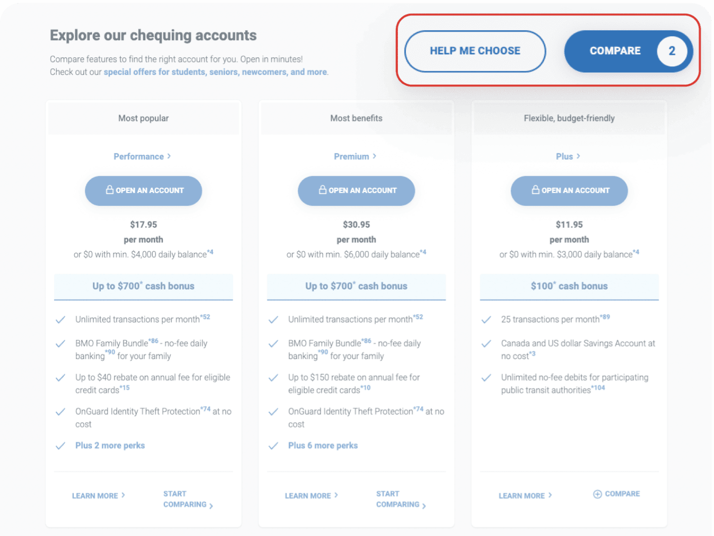
01 · Missed capability
Four of six participants did not use the comparison feature; they scrolled between cards and compared details from memory.
02 · Labels without a decision rule
Names such as “Performance,” “Premium,” and “Plus” describe tiers but do not tell a first-time visitor which situation each account fits.
03 · Requirements arrive late
Three of six participants could not find opening requirements while they were still deciding between accounts.
Requirements were treated as application details, not selection criteria
Three of six participants could not locate the requirements for opening an account. The information appeared later in the application path, after people had already begun comparing options. For a first-time visitor, eligibility belongs beside fees and benefits because it determines whether an option is viable at all.
The mortgage journey created two different kinds of wrong turn
Two participants entered the affordability calculator before recognizing that the scenario required the payment calculator. Once inside the correct tool, all six participants missed the monthly payment displayed at the top and scrolled downward looking for it. Navigation vocabulary and result hierarchy compounded each other.
“Wait, that's the monthly payment? I scrolled right past it.”
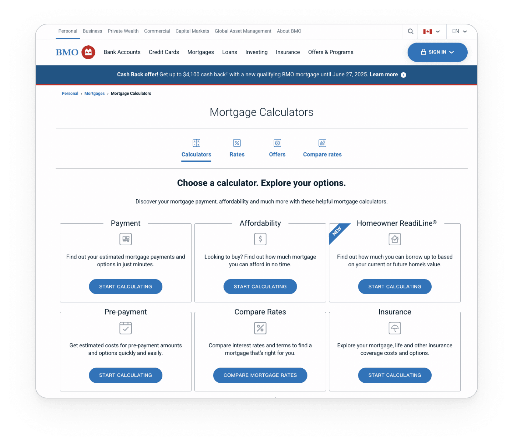
01 · Choice before comprehension
Two participants entered the affordability tool before realizing the task required the payment calculator.
02 · Opportunity
A short goal-based selector could ask what the visitor wants to learn, then route them to the appropriate calculator.
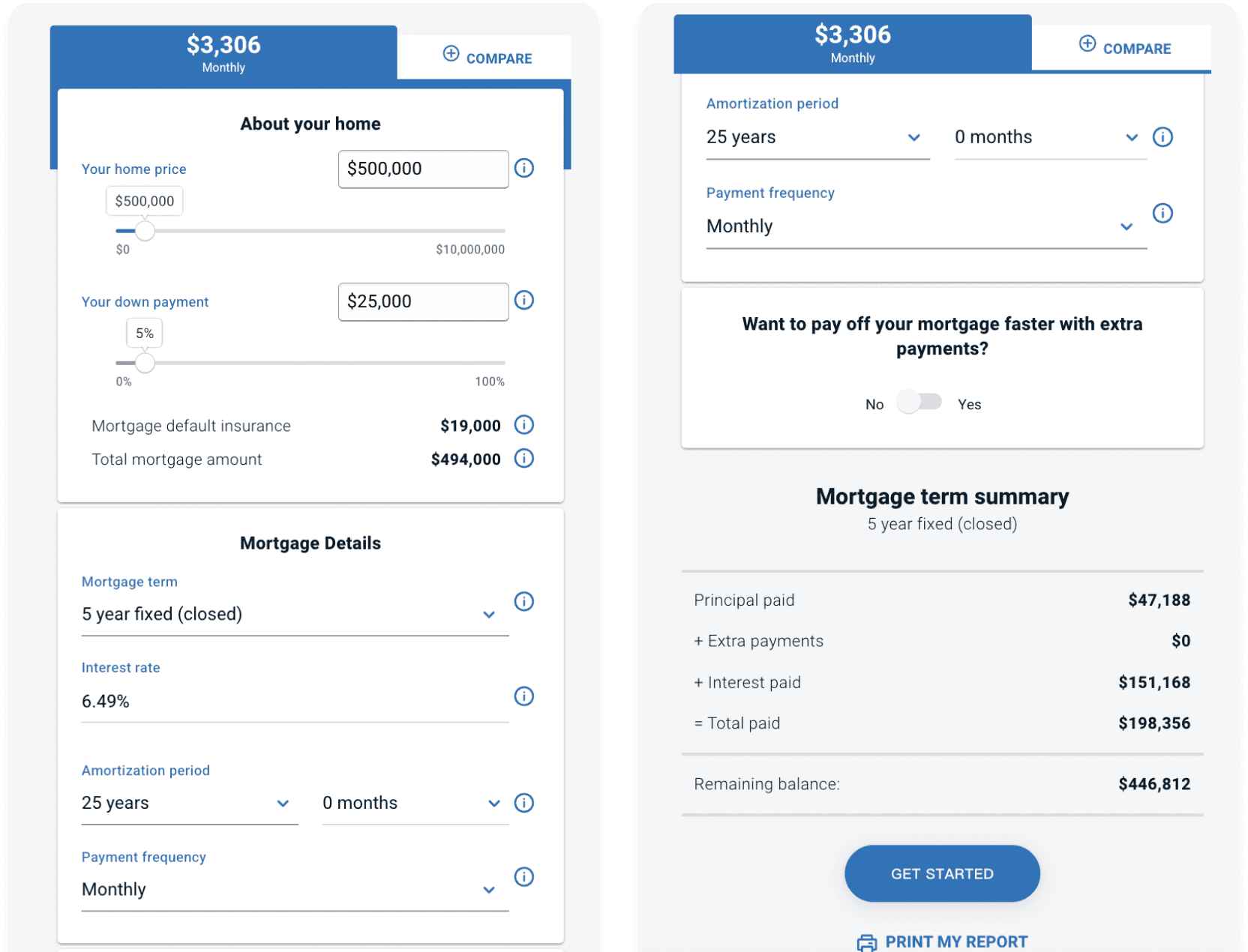
01 · Present but unseen
All six participants missed the monthly payment at the top and continued scrolling for the answer.
02 · Decision context
Keeping the result beside the inputs would make the relationship between a changed assumption and the payment immediately visible.
Invisible comparison
People scanned cards and carried details in memory.
Keep comparison controls and differentiators on the decision surface.
Hidden eligibility
Requirements appeared after product consideration had begun.
Show opening requirements before the application path.
Tool ambiguity
Similar calculator names led participants into the wrong path.
Route by user goal, then name the expected output.
Buried answer
Every participant continued searching after the result appeared.
Keep the result visually coupled to the inputs that change it.
Response — convert findings into testable hypotheses
The concept work explored two responses: a comparison view that explains why an option may fit a person's stated priorities, and a calculator that keeps the monthly payment prominent while assumptions change. Both reduce the need to remember values across pages.
The AI recommendation and “smart tip” treatments in the concepts go beyond what the evaluation proved. The study supports visible rationale and proactive guidance; it does not prove that AI is the preferred or most trustworthy delivery mechanism. A follow-up concept test should compare rule-based guidance, guided questions, and an AI-assisted explanation before selecting an implementation.
A prioritized evidence set, task-level recommendations, and concepts ready for a second evaluative round—not a claim that the public product changed.
Learn — completed is not the same as confident
Binary task success concealed important hesitation. A participant could eventually reach the calculator and still select the wrong tool first; they could enter every value and still miss the number the tool existed to provide. Pairing step-level behavior with think-aloud data made those gaps visible.
The sample was small, younger, and primarily mobile-first, while sessions occurred in a controlled setting. The concepts were not tested and the study cannot support claims about conversion, application completion, or live business impact. The next round should include older participants and recent newcomers, test the concepts on mobile, and measure both first-path accuracy and whether people can explain why an option fits them.
In high-stakes services, confidence depends on seeing the decision rule—not merely reaching the end of the flow.