CarbonTrace
Two phases, and a decision the evidence made
- Role
- UX Researcher — led evaluation design and recruitment; co-designed prototypes
- Status
- Client capstone · Research lead
- Timeline
- 2025–2026
- Methods
- Within-subjects comparative usability evaluation · counterbalanced · bilingual EN/Mandarin sessions · SUS
- What changed
- Evidence base for the client’s prototype direction decision
A small-N study earns its conclusions through design, not sample size: within-subjects comparison, counterbalanced order, and a rule that no insight counts until it appears in two independent sources.
81 codes → 3 core insights
6 of 6 preferred Version B
82.9 SUS score
From route setup to a result people can interpret
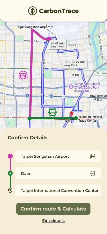
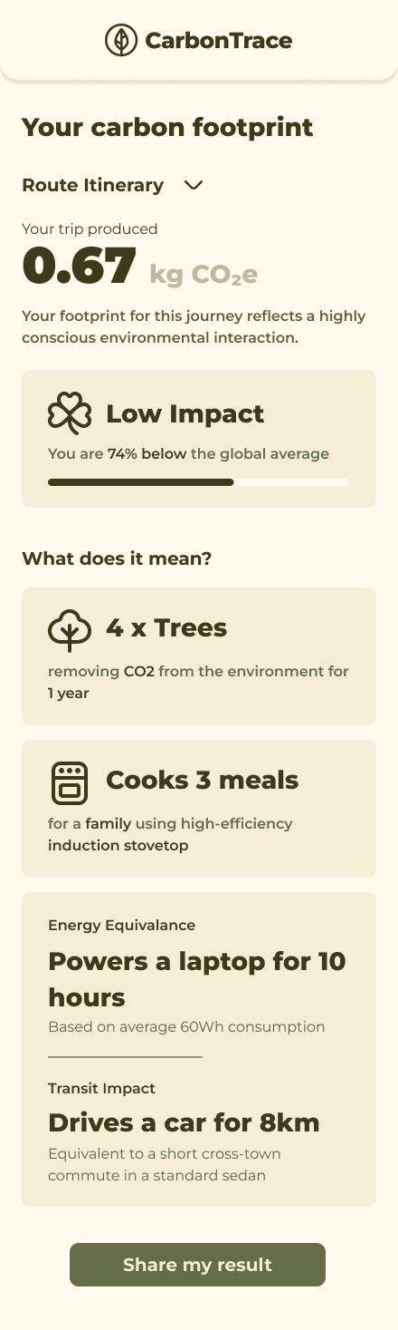
The redesign shifts the experience from configuring a system to telling the story of a trip, then explains what the carbon number means.
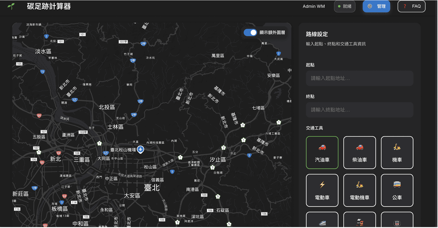
Location search, map controls, route settings, and transport choices competed for attention before the value of the task was clear.
The 30-second task people did not finish
CarbonTrace is a mobile web tool used at events in Taiwan. Attendees scan a QR code, reconstruct how they travelled to the venue, and receive an estimate of their carbon footprint. Hundreds of people started the original flow, but roughly 45 completed it. The client knew where people left; they did not know why.
I led the research plan, recruitment strategy, bilingual interviews, synthesis, and comparative evaluation, then helped translate the findings into prototype requirements. The research needed to answer two linked questions: what made the original experience difficult, and which redesign direction resolved those barriers more convincingly?
In a busy event context, should the interface minimize what people see—or make every step unmistakably clear?
Discover — build evidence without a user list
The platform was anonymous, users were in Taiwan, sessions needed to work in Mandarin and English, and there was no baseline research. Those constraints ruled out a single-method study. I used semi-structured interviews as the core, supported by a post-task survey, heuristic evaluation, literature review, and analogous-product analysis.
Interviews
Survey
Heuristics
Literature
Analogues
An insight moved forward only when at least two independent sources converged on it. Recruitment through the client's network remained a documented source of positive bias.
Interviews ran in Mandarin where that improved data quality, followed by translated notes so the full team could synthesize together. Across the study, 81 raw codes were consolidated into three core insights and three recommendations that the client carried into concept testing.
Frame — the problem was effort without meaning
The evidence reframed drop-off as more than a form-design problem. People had to translate a multi-stage journey into the interface, invest attention while moving through an event, and then received an abstract number that was difficult to judge. Even a participant working in environmental policy could not interpret the carbon result.
Input friction
People recall travel as a sequence of places and modes.
Mirror that narrative: location → transport → next stop.
Ambiguous output
A carbon number alone did not tell people whether their impact was high or low.
Keep the CO₂e value, then add a benchmark and relatable comparisons.
Weak payoff
The task required effort before its value became visible.
Explain the purpose early and make the result useful and shareable.
Compare — clarity versus visual minimalism
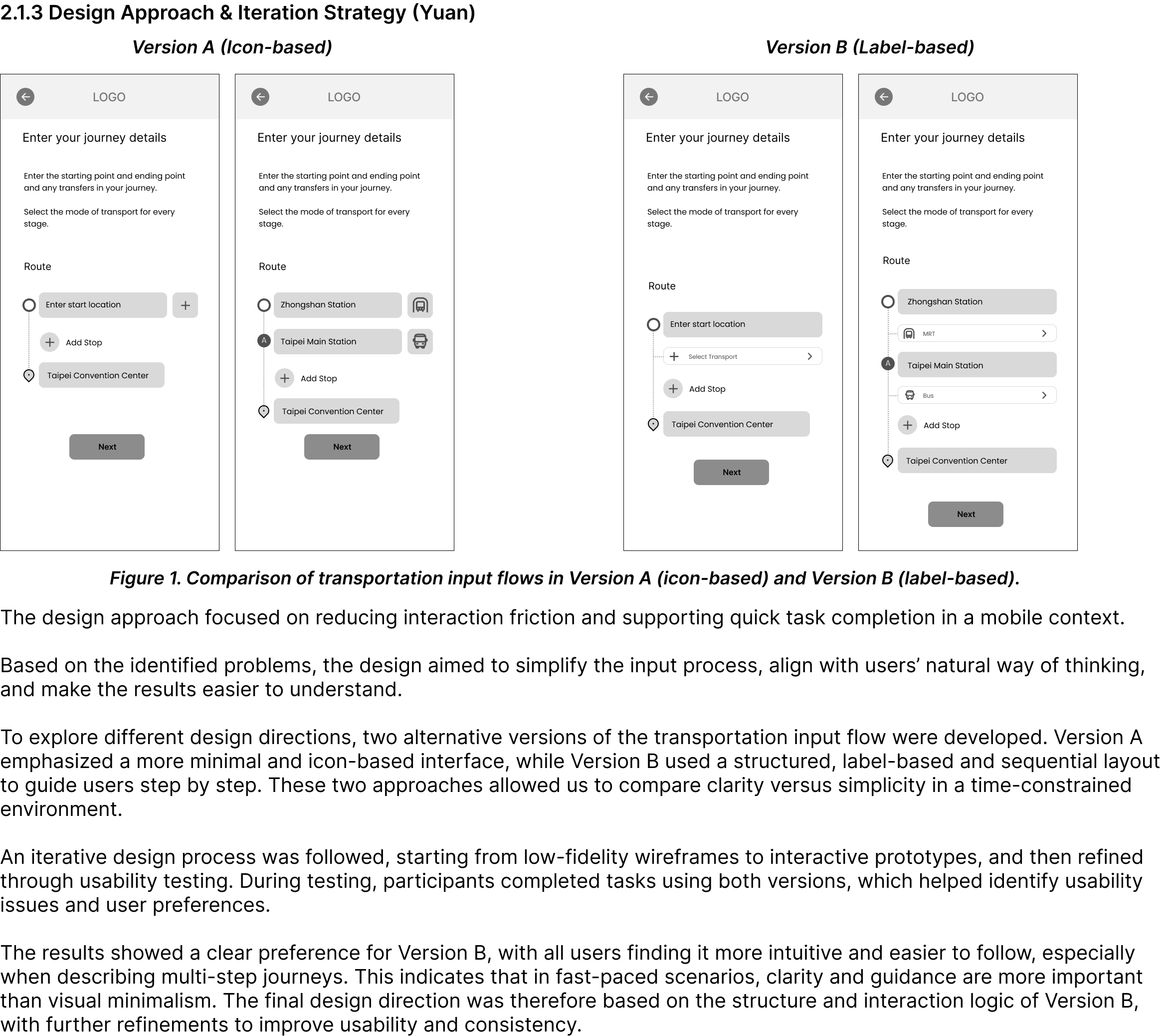
The redesign produced two credible input concepts. Version A kept the screen visually minimal and relied heavily on icons. Version B exposed the sequence with labels and separate controls for locations and transport modes. Rather than choosing by team preference, I designed a within-subjects comparative usability study.
- Participants
- N=6, screened against explicit criteria
- Design
- Both versions; order counterbalanced
- Session
- Moderated think-aloud in English or Mandarin
- Measures
- SEQ per task; SUS per prototype; debrief
Two critical issues made the decision concrete
All six participants could not tell whether their emissions were high, low, or average relative to others.
In Version A, the same “+” icon appeared to mean both add a stop and select a transport mode, producing trial and error.
“I see a plus icon, but I'm not sure if it is for adding stops or transport mode.”
Decide — guidance earned the final direction
Six of six participants preferred Version B, and it scored 82.9 on SUS. Think-aloud observations explained why: explicit labels and a visible sequence matched how people reconstructed multi-modal trips. In this context, clarity outperformed visual minimalism.
Adopt the labeled sequential flow and fix the event venue as the destination.
Colour-code route stages and make the confirmation step editable.
Replace the bare result and weak route suggestion with benchmarks and everyday comparisons.
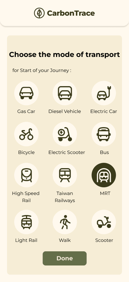
01 · Mode choice
02 · Confirm route
View the complete end-to-end prototype flow

The handoff connected each change to a research requirement and included the selected prototype direction, a UI design system, and developer-ready specifications. Secondary findings also informed the map treatment, welcome-page entry point, and share preview.
Learn — a strong decision is not the final outcome
This study supports a choice between two prototypes; it does not yet prove that the redesign increased completion in live events. The sample was small and recruited through the client's network, and the evaluation happened in a controlled setting without the distractions, time pressure, or connectivity issues of an event venue.
The next step is a field pilot with a broader, less motivated attendee sample. I would measure completion rate and time alongside comprehension of the result, then test whether peer benchmarks create motivation without turning a sustainability tool into an unhelpful competition.
A small-N study earns confidence through comparison design, converging evidence, and honest limits—not through claims the data cannot support.